leannenmbec18
Sunday, 10 April 2011
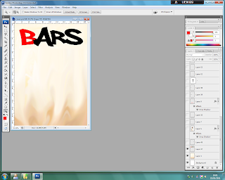
These are many of the tools i used on photoshop to create my product
Eliptical marquee
Rectangular marquee
magnetic lasso
Single row marquee
Magic wand
Vertical type
Eraser
Line - dividing double page
Zoom - make image clear enough to erase unwanted bits
Path selection - move images and text
Sharpen - smooth sharp edges after using lasso
Blur - merge background together to smooth out
Gradient - used on one of the masheads
Fill - used for buttons
Airbrush - used on images
Smudge - merge background together to smooth out
Brush - used to fill gaps
Hand - used to move page
Colour selectiong box
Opacity
Drop shadows
Hue & saturation
to allow me to create a layout that directs the eye of the reader to specific points of importance first, such as the main image and focus of the features, I became interested in the layouts of certain magazines that sell well and target my chosen audience/an audience similar to the focus of my product.
In order to enhance my products professional quality and overall aesthetic standard,
I decided to explore a variety of layouts used by high and low profile magazines that focus on my target genre and/or age group.
Vibe’s contents page however is not conventional, as it contains only one image. Although, the text is minimal, the image has a caption and the ‘Contents’ is not too large.
The double page spread is also unique to Vibe, as there is one main image, however it is not very large and is placed so it only covers 1/3 of the 2nd page. There is a pull quote and standfirst, but also another image across both pages.
The German magazine below is also unconventional as it, like vibe, includes only one image, and of an object instead of an artist. The page numbers have been enlarged and there is also a lot of text.
This double page spread is conventional, as it includes a standfirst, columned text, a large image covering the whole 2nd page, a caption and the colour scheme matches the image.
Q’s front page conventionally uses a button, a band and a large main image. Also the text feature overlaps the image, but the other text does not. The main image was also taken from a long shot and unlike most magazines, features more than just one artist/prop.
The colour scheme on this double page is apparent and matches the image. The text is easy to read and is columned, and features a pull quote to engage potential readers. There is a long standfirst and a large heading.
This front cover is different to most conventional covers, as the masthead is almost completely covered by a large main image and is difficult to read, however the text overlaps only slightly and a selling point and button are used.
Kerrang!’s contents page differs from issue to issue, like Vibe, but conventionally uses a variety of images and minimal text. Captions are used and there is a colour scheme.
After looking at a variety of magazine covers, contents and double pages I have decided to use both conventional and unconventional aspects of the different layouts.
I will use columns for the interview and a large image covering the 2nd page, I will use 1 artist only on my front cover with other text, a selling line, a button and a band and I will use multiple images, minimal text and large page numbers on my contents page. I will also use a colour scheme that is apparent throughout my product.
Vibe Magazine seems to follow typical conventions of a magazine layout, as the main image is centred, the artist is engaging the reader with eye contact, the text is not overlapping and the masthead is visible and bold, yet behind the image.
Wednesday, 6 April 2011
Tuesday, 5 April 2011
I cropped a section of the background and pasted it multiple times, then blended them all together to create a smoother background
I added a masthead and used the magic wand to select the B and change its colour
I imported my image and added a drop shadow
I added the date and the band
I added the button and main feature
Subscribe to:
Comments (Atom)


